B-99 House: A fusion between the ancient and the modern!


It is not very often that modern minimalist homes from India steal the show on a global stage, but the B-99 house looks so gorgeous that it could very well be a structure standing in the heart of Hollywood. The contemporary edifice designed by DADA Partners in Gurgaon, India welcomes you with its very unique seating area clad in glass and sporting a trademark metal ‘V’ supporting the upper floor.

With a staircase that forms the focus of the home, large wooden interiors and posh accessories; B-99 sports an ultra-fashionable look. Yet, the extensive courtyards, and the placing of the living room, kitchen, dining space and other areas of the home show that the ancient Indian art of design called ‘Vastu’ has been still followed meticulously. When it comes to a fusion of the old east with the modern west, B-99 wins hands down!

  • Digg
  • Del.icio.us
  • StumbleUpon
  • Reddit
  • Twitter
  • RSS

Beautiful House Surrounded by Forest and Lush Landscape


Designed by Boora Architects the Kitchel residence is located in Northwest Portland, Oregon. Surrounded by forest and lush landscape, this unusual home’s boomerang shape aligns with the terrain. This house has 825-square-foot that includes a kitchen, a dining area, and a living room on the lower floor. A bedroom and office perch above in a dramatically contoured, sparsely decorated loft. The most interesting part of this house is the 38-ft. bookshelf that extends from the bedroom, through the hallway and into the office area.

  • Digg
  • Del.icio.us
  • StumbleUpon
  • Reddit
  • Twitter
  • RSS

1960 Canna Road Residence Turned Modern


Located in the Brentwood District of Los Angeles, Canna Road Residence is a dwelling place that is totally beyond your expectation for a mid-century residence. Originally build by a California-based architect Ray Kappe, this house was opportune enough to be beautifully touched up by Michael LaFetra a few years ago — and now the house has been sold at $4,495,000 for someone else to enjoy. Crafted of wood and glass material,the Canna Road Residence consists of a stunning living room, 5 bedrooms, 3.5 bathroom including a full floor master with roof deck, a conventionally minimalist dining room and a freshly refurbished kitchen.

  • Digg
  • Del.icio.us
  • StumbleUpon
  • Reddit
  • Twitter
  • RSS

Deluxe apartment in the sky


Movin’ on up, now more than ever encapsulates stunning design, impeccable service, effortless living from the time the sun rises to well after the sun sets. We’ve been noticing a rising trend in the sheer number of luxury residences - we recently told you about an exclusive collection of seaside properties in Abu Dhabi. And now from New York to Buenos Aires, and from Moscow to Beijing, we’ll reveal a few more of the coolest luxury abodes.

Many of us have been accustomed to the stylistic cues offered by W Hotels across the world — but how many of us will actually have a chance to pick up the phone from our own kitchens and receive assistance from the ‘Whatever, Whenever’ hotline? Soon, for those who jumped at the chance to purchase a W-styled apartment in one of their newest locations south of the World Trade Centre in New York City, the possibilities will be limitless.

W Residents may share the building with distinguished hotel guests in the lower portion of Manhattan, but luxury amenities such as a rooftop terrace, a fitness centre and spa in the sky, a media screening room and digital lounge, as well as a separate entrance, will be solely for those permanently living in the upper floors of the luxury tower.

While the W Hotel New York Downtown will take up the first twenty-two floors, the upper levels have been split into furnished residences (Floors 23-30) and customised residences (Floors 33-56). Interior design exceeds expectations, even by W standards, with sleek and functional kitchen built-ins to a translucent wall from the bedroom to a ‘peek-a-boo loo.’

A bit further in the heart of Tribeca, Five Franklin Place is destined be the epitome of luxury residences. The 20-storey building will contain 55 one-, two-, three- and four-bedroom units that will be set up as duplex lofts on the lower floors; single-level city residents above; plus three triplex penthouses each with a rooftop terrace and serviced by private internal lifts.

The building itself, designed by Dutch architect Ben van Berkell of UNStudio, will be wrapped in a series of horizontal black metallic bands — each of which ungulates as it curves around and hugs the frame of the structure. The façade is apparently a direct tribute to the original 19th-century built form of cast iron that shaped lower Manhattan — and the metallic surface will reflect light while highlighting the magnificence of the neighbouring buildings.

The building’s façade is not merely about aesthetics, as the bands will also create shading from the daylight, deflect heat, and guarantee every residence will have the highest degree of privacy, and simultaneously frame unparalleled views out across Manhattan.

The Loft Residences on the levels have a double-height living area that maximises the light entering the space. The height of the great room continues on through a gallery where a white lacquered library wall ascends up into the second level.

The upper-tier City Residences feature integrated terraces off the main living areas, and all units are custom-fitted with B&B Italia kitchens and built-ins throughout. The master bathrooms feature a circular sliding wall that allows the bathroom to become part of the bedroom and share its spectacular city views.

And for those at the top, the five ultra-luxurious Sky Penthouses are unmatched in practically every aspect. Again, B&B Italia has masterfully crafted the space, including the kitchen. Sweeping views from every room, even the master bathroom, automatically heighten the occupants’ awareness of their place in the cityscape and the surrounding environment.

The skylines of our cities are rapidly changing — ingeniously designed buildings are competing for our attention. But architectural beauty alone is not going to provide the type of service we’re growing accustomed to expecting after spending millions on luxury lifestyle. We feel that the rise of luxury residences has only just begun

  • Digg
  • Del.icio.us
  • StumbleUpon
  • Reddit
  • Twitter
  • RSS

Moving picture's company


Patrick Tighe, principal of Santa Monica’s Tighe Architecture, may hate space-age references. But, here we go: Tighe’s work for Moving Picture Company’s (MPC) Los Angeles office IS space-agey. With its pod-like central spaces, curving ledges and white drywall expanses, it evokes memories of retro space movies.

But it all fits. The U.K-based MPC is in the business of computer animation, color-grading and digital effects, so you wouldn’t want color, hard edges or natural light to mess with that. MPC is known for its work on the past six James Bond films, Slumdog Millionaire and commercials.

In turn, Tighe’s residential and commercial work is characterized by roofs shooting out at angles, curves sweeping, horizontal planes slanting. Your eye follows these lines easily and accepts the direction. A goal that MPC is most likely familiar as well.

  • Digg
  • Del.icio.us
  • StumbleUpon
  • Reddit
  • Twitter
  • RSS

A Bank ???


In most cities, strategic downtown street corners are flanked by enormous, old banks, the ornate cathedrals of capital designed to impress and intimidate. With the massive changes in real estate values and consumer banking habits, such monuments to Mammon are no longer smart or necessary. But what amazing opportunities such massive commissions must have been for the architects of the day! And what depressing alternatives we’ve experienced since! Luckily, online banking has made a bank visit almost obsolete, but when you must visit, most of the time you’ll find a boring, convenience-store-type standardized box – retail banking in the worst meaning of both words.

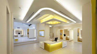
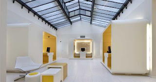
But we are starting to see a change. Several new bank design concepts are in the works, and some have been launched recently, including CheBanca! in Milan by Crea International. The concept for CheBanca! (translation: What a bank!) reflects the brand’s simplicity, transparency and innovation. When Crea International co-founder Massimo Fabbro will speak at POPAI Italia, in November on the power of physical brand design to bring to life a brand's language, spirit and values, he will no doubt mention CheBanca!

  • Digg
  • Del.icio.us
  • StumbleUpon
  • Reddit
  • Twitter
  • RSS

Reuben Wood Salon in Manchester is Burnt Toast


Peter Masters of Burned Toast Design is known for his elegant bent-wood and curved-acrylic tables and chairs, but the Manchester, UK-based furniture designer can be big, bold and public, if required. A recent re-vamp of the funky Reuben Wood Hair Salon in Manchester’s city centre shows that Masters has the talent to create an entire environment that is eclectic, electric and elegant.

Using simple curved mirrors, he created the storage units necessary to hide the day-to-day paraphernalia of a busy hair salon. The creation of the large mirrored surfaces dictated that everything else needed to be streamlined and toned-down so that the space would not appear too busy or scattered when clients and staff would populate it.

The long blue table in the middle of the salon is an industrialized version of Masters’ Horse design. The mirrors in this station are removable which makes it easy to change the look of the space without destroying the overall feel. Dashes of pink, green and blue play off the larger surfaces of black and white, and create focal points in the mirrored environment.

When making and designing furniture, Masters plays with a large variety of materials, methods and technologies. Laminating plywood, casting resins and metals, fabricating plastics and upholstery are all familiar to Masters, as are using a machine created for violin manufacture or hand-crafting custom pieces from sustainable materials.

  • Digg
  • Del.icio.us
  • StumbleUpon
  • Reddit
  • Twitter
  • RSS

Lac Superieur Residence,Mont-Tremblant,Canada


The boxy and containery appearance of residential buildings currently attracting accolades and attention is starting to get boring. However, simplicity, clarity and openness are qualities that continue to appeal.

While this is yet another house of stacked boxes, we cannot help but admire the vacation residence clinging dramatically to the sloping hill up in the trees of the Laurentian mountains of Quebec, Canada.

Locals, used to a more traditional ski chalet in this popular ski resort area, refer to the building as the cube, a name choice requiring no imagination. When the Montreal-based architectural firm Saucier + Perrotte won the Canadian Architect magazine’s Award of Excellence for this project in 2004, the magazine called the entry the Lac Superieur Residence in Lac Superieur, Mont-Tremblant.

Whatever the moniker, the house stuns with its elegant lines, stylish use of materials and lack of unnecessary distractions.

As it should be, the building’s real redeeming features reveal themselves inside. The views from the floor-to-ceiling windows provide all the visual stimulus you’ll need, and at the same time, demand a streamlined approach to everything else in the interior.

The boxy-cubey theme continues inside as do the color scheme and the lack of distracting materials. The residence is divided into three functional areas’ sleeping quarters on the top floor, middle and entry floor for living and the lowest level for play.

Although the building looks like a disorganized corner of a stylish container-port it exudes a solitary, silent grace that allows the distinctive, four seasons of the mountain to provide the main attraction.

The building meets the criteria for a log cabin as described in the area’s design guidelines for recreational development yet, fortunately, fails to resemble a Tyrolean mini castle

  • Digg
  • Del.icio.us
  • StumbleUpon
  • Reddit
  • Twitter
  • RSS